A few years ago I took it upon myself to submit a supporting comment on Transport for London’s plans to build new homes on the car park at Cockfosters station. Although it’s just across the borough boundary in Enfield, it’s only a few hundred metres from where I live in New Barnet, and the application was worthy of support. Then Chipping Barnet MP, Theresa Villiers, was running an active campaign against the plans, which was as a good a reason as any to add my name to the list of those in favour.
I’d not thought much about it before then, but having found the application reference (handily provided on one of the many anti-development leaflets that dropped through my door), and registered on Enfield’s website, I found myself presented with a long list of checkboxes setting out the reasons why I might want to object to the proposals. This included a veritable NIMBingo card of objections; yet missing was anything that could be considered a positive justification for the development.
Many weren’t even valid planning objections at all: included on the list was “general dislike of proposal”, but nothing about the desperate need for new homes. “Noise nuisance” made an appearance, but missing was a checkbox acknowledging a positive contribution to the local area.
If you found yourself wanting to object to a planning application but you weren’t sure why, this provided you with a perfect “to do” list of reasons. It’s difficult to imagine anyone sufficiently enraged by the idea of new housing that they’d be selective about what they were ticking and why. “I just don’t like the look of it, but yeah – the land is probably contaminated too!”
To Enfield’s credit, when I raised this with the head of planning, he acknowledged that this list was unnecessarily biased, and it was duly revised to include an equal balance of positive and negative sentiments. Alongside “development too high” appeared “improves the quality of the area”; “loss of parking” was countered by “makes sustainable use of land”, and so on. Simply ticking every box from top to bottom was now counter-productive: those wishing to object, or support, an application were now forced to carefully consider each option.
This got me thinking about the inherent bias in the planning system in favour of those railing against development. I spend a lot of my life raking through planning applications and am familiar with many of the terms used, but for someone who’s engaging with the system for the first time this can be an intimidating and confusing experience.
You just need to look at the front page of many council homepages to see this bias at first hand. The screen grab below is from the front page of Barking & Dagenham’s website (I’m not picking on LBBD here: it just happens to come first in the alphabet), and demonstrates a tacit assumption that nobody would, in their right mind, actually write in favour of development:
Clicking through to the planning portal itself, it gets worse.
The impenetrable nature of Idox is for another day, but even once you’ve managed to locate the reference of the application you want to comment on, you are required to complete a long and complicated registration form to do so.
I suppose that, unlike me, most people will be commenting mostly on applications which immediately affect them and will only every need to go through this procedure once, but you can see how someone without much time on their hands, who moves home regularly as a consequence of precarious circumstances, or is unfamiliar with engaging with the authorities, might be put off by this step.
I’m in two minds about the need to register to make a comment: on one hand I can see how it might limit spurious or trivial comments that take up officer time; on the other, I can also see that it might be off-putting for those more likely to support new development (older, established residents are, I suspect, more likely to have the capacity to spend time grappling with user-unfriendly web portals). But, on balance, I’m not sure that requiring commenters to register is a good thing.
Some planning authorities—my home borough of Barnet included—have removed this list entirely, so it’s up to respondents to decide for themselves whether they believe a particular scheme meets local planning policy. The bias against supporters is apparent elsewhere on the site, however.
It’s well known that public consultation is a bit of a nonsense anyway as every application needs to be assessed on its own merits, and officers are perfectly capable of determining whether a proposal for development is broadly compliant with policy (and if the planning committee disagrees, the Planning Inspectorate certainly is). The only purpose served by the commenting process is to apply pressure on elected officials to resist development.
Islington Council’s website is entirely neutral in its language, offering visitors the opportunity simply to “view or comment” planning applications; although the ability to find anything without the specific planning reference is impossible. Not to have an interactive web map displaying all current planning applications cannot surely be acceptable in a planning website that was only updated this year.
Richmond-upon-Thames’ website is marginally better: searching for applications is painful (another borough without an interactive map), nowhere does the site refer to “objecting”, and there’s no need to register in advance. Sensibly, personal details are limited to a name and email address.
All in all, the general state of London’s planning portal is woeful. A lack of online mapping, anachronistic interfaces and dysfunctional search facilities abound. Given the importance of housing in London, surely we deserve better than this? It’s no wonder people, including those for and against new development, feel disengaged from the planning process when it’s so hard to register an opinion. Perhaps the new government might want to invest in a unified platform, provided freely to local planning authorities, to speed up the planning process.
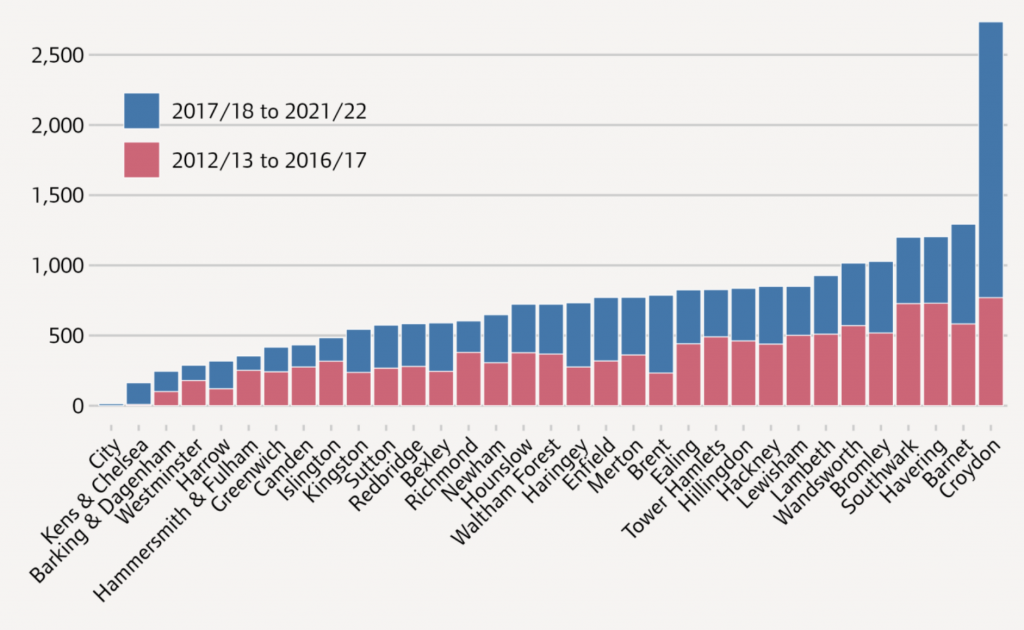
As it happens, despite Theresa Villiers’ intervention and a vigorous local campaign, the Cockfosters application was narrowly approved by Enfield’s planning committee—albeit in a meeting that went on into the early hours. The application was later stalled by an intervention from then Minister of Transport Grant Shapps, and when this was overturned, by issues around financial viability. In total, Enfield received 2,852 formal objections, with just 15 in support. That the committee voted in favour of the scheme is a credit to elected members. But it does suggest, at least to me, that the system is rigged and it’s time to do something about it.
If you’re interested in knowing more about the planning system works, and how you can help support planning applications for new homes in your area (or anywhere else, for that matter), I wrote a handy guide which you can download here.
In recent weeks the Labour party has reaffirmed its commitment to building 1.5m homes in its first term of government. What is not yet clear is how it intends to achieve this figure. Part of the strategy is a new towns programme, as announced by Angela Rayner at the UKREiiF property conference in Leeds last month and confirmed in last week’s manifesto.
But, while building new settlements in the countryside is a headline-grabbing proposal, this is a multi-year enterprise, relying at the very least on compulsory purchase reform, huge investment in infrastructure, changes to strategic planning, and the formation of development corporations. Even with a good headwind and an improving economy, there’s little chance of the target 300,000 homes each year being built via this route any time soon.
The UK has not achieved anywhere near this level of housing delivery since the 1970s, despite this being a central tenet of the Tory manifesto. Housebuilding has sent the Conservatives into paroxysms, with its own backbench MPs campaigning against the very policies ministers have claimed are necessary to meet these targets. So how might a new administration jump-start housing delivery without getting bogged down in the quagmire of long overdue planning reform? The leafy suburbs of south London might provide a clue.
In 2017 Croydon Council published guidelines setting out how its outlying areas should be gradually intensified through small site development. The council was already delivering a heroic number of new homes through the development around East Croydon station, although for a time this included a large number of very poor office-to-residential conversions. Rightly identifying that every part of the borough has a part to play in meeting the city’s acute housing need, its Suburban Design Guide received plaudits as an innovative way to meet its housing targets as set out in the London Plan.
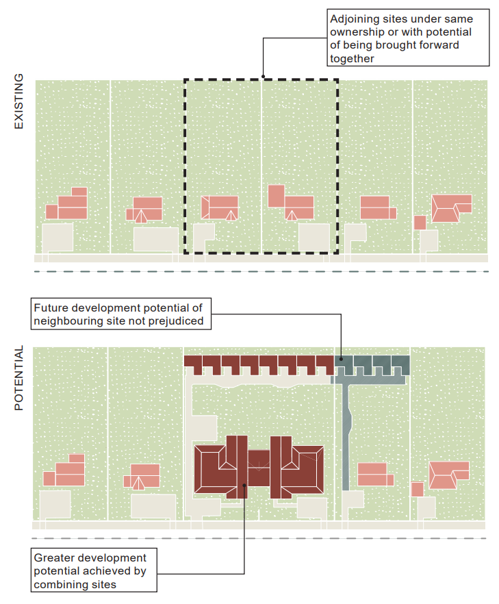
The guidance was intended to provide applicants with certainty around what type of development would receive support. It included a range of long-term development scenarios which showed how different suburban conditions might evolve over the next 20 years, providing explicit examples setting out how, for example, a single detached family house on a large plot might be demolished and replaced by a block of flats facing the street, augmented by a small terrace of townhouses to the rear. Other examples set out conditions through which semi-detached and terraced houses might be redeveloped to significantly intensify individual plots and, through assembly of adjoining dwellings, push the uplift even higher.
Armed with this guidance, small developers could acquire land with a good idea of what it was worth, due to the ability to predict what might be built on it with a high degree of certainty. And by following the guidance in the SPD, schemes could be drawn up by architects safe in the knowledge that they would be supported by planning officers. The accurate balancing of acquisition cost and development value also meant that there was little benefit to flipping sites, in the hope that each time this happened a little more could be squeezed from the scheme — a phenomenon which pioneering small site developer Roger Zogolovitch referred to as “pass the parcel”.
The Croydon guidance focused on a handful of areas identified for intensification where the council believed there was greatest capacity for new homes — primarily those with low densities but close to high streets or train stations. The results of this policy were remarkable: in a four-year period, Croydon delivered nearly 2,000 homes on small sites, three quarters of which were within developments comprising fewer than 10 homes — by far the largest number of any borough in London. That’s not just approved, but built. The second highest (some way behind) was Barnet, which in the same period managed 700, despite being almost exactly the same size and having the same area of green belt.
Extrapolating this approach across the remainder of London’s low-density suburbs surely has the potential to yield a very large number of new homes. But how many?
Most of central London sits somewhere between 20 and 60 homes per hectare (dph), with a few pockets around Kensington, Bayswater, Tower Hamlets and Maida Vale which top out at about 150dph. In outer areas this drops as low as two dwellings per hectare, even within ten minutes’ walk of suburban stations (Crews Hill, in Enfield’s green belt is an egregious example; albeit soon to be corrected).
This is clearly an aberration in a world city, particularly when one considers the massive green belt, the very purpose of which is to promote urban intensification. Current green belt designations make little sense where there’s nothing to distinguish it from the boundaries of those cities it’s intended to constrain. 10% of London’s total area is located within ten minutes’ walk of a station whilst simultaneously having a residential density of less than 20 dwellings per hectare.
An obvious route to meeting the one-and-a-half million homes that Labour has committed to would look more closely at these areas and focus development on suburban intensification. Croydon has shown this can work. But development of this scale does not come without compromises, and incoming Conservative mayor Jason Perry unceremoniously scrapped the SPD after running on an unashamedly NIMBY ticket.
Across London there’s around 47,000 hectares of suburban housing within 800m of a station, once protected open space and industrial land are removed. This has an average density of just over 31 dwellings per hectare. An uplift of just 25% in density, capped at 100dph and no lower than 40dph, could yield some 900,000 homes — just in those areas less than ten minutes’ walk from a station. Coupled with more modest increases outside these areas, the figure is well north of a million — and that’s just in London alone.
Expanding this approach across the rest of the country could easily get to the targets that Labour has set for itself; putting a rocket booster under regional economies to boot, as local developers, trades and supply chains respond to a sudden increase in demand for their services. Berkeley Homes alone currently builds around 10% of all homes in London. This isn’t a healthy state of affairs, but when we place so many hurdles in the way of small-scale development, it’s no wonder we suffer from housebuilding hegemony.
40 dwellings per hectare isn’t high, being equivalent to a neighbourhood of two-storey Victorian terraces. Applying a 25% increase in density to all of the areas identified, with a minimum threshold of 40 and a maximum of 100 and making a modest adjustment for those parts of London which have a high proportion of detached and semi-detached houses or large gardens, the areas within 10 minutes’ walk of London’s stations can accommodate around 850,000 homes. Include the areas just outside this, and there’s potential for over a million. Far from being a “war on the suburbs” as some have claimed — such an approach would help breathe new life into them.
Despite the protestations of comfortable suburban homeowners, suburban intensification would not radically transform the character of their neighbourhoods. There are myriad examples across London of sprawling, inefficient, land-hungry houses being replaced by compact and sustainable family homes. A charming example of this is to be found in Purley, where small site specialists Harp & Harp have designed seven new family homes on a corner plot. Repeating this on each corner of the block would easily achieve a 40% uplift in density, whilst being entirely compatible with local character. Yet local Nimbys have repeatedly attempted to challenge the planning approval, including at the High Court, no less.
What policy levers might an incoming government pull to jump-start intensification? Paragraph 129 of the National Planning Policy Framework already states that local plans “should include the use of minimum density standards for city and town centres and other locations that are well served by public transport.” However, a get-out clause remains: authorities can knock back development “if the resulting built form would be wholly out of character with the existing area”.
It’s time to pop that statement in the recycling bin. Instead, the government should follow examples in Canada and New Zealand and adopt a very strong presumption in favour of intensification close to stations, coupled with a prohibition on minor applications being decided under anything other than delegated powers. National housing targets should include a proportion to be delivered on small sites, rather than considering these as “windfall”. Finally, all planning authorities should be mandated to produce small site design codes, with a national version to fall back on should they refuse to do so.
Labour has already identified the lagging economy, pitiful productivity and the dire social and environmental consequences of poor-quality housing as major barriers to growth, but the idea that it can deliver 1.5 million homes via a new town programme in the first term of government if for the birds. Rapid intensification of our cities’ suburbs might offer a solution.
How lessons from Croydon can be applied to London’s suburbs to deliver thousands of new homes through modest intensification.
“Boroughs should…recognise in their Development Plans and planning decisions that local character evolves over time and will need to change in appropriate locations to accommodate additional housing provision and increases in residential density through small housing developments.”
Draft London Plan, December 2017
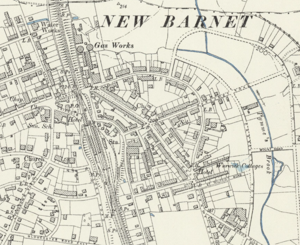
I live in suburban north London, in a neighbourhood which sprang from almost nothing in the late nineteenth century with the arrival of the railway. New Barnet station is at the end of my road and my house was built on land previously bought by the railway company: we still have the original deed of transfer from 1899 which details the sale of our plot from the railway company to the developer who bought it and built the home in which I now live.
New Barnet in 1897. The railway arrived in 1850 when farmland was acquired by the Great Northern Company to enable the construction of the route, and then the land around it was sold to the British Land Company (image from National Library of Scotland).
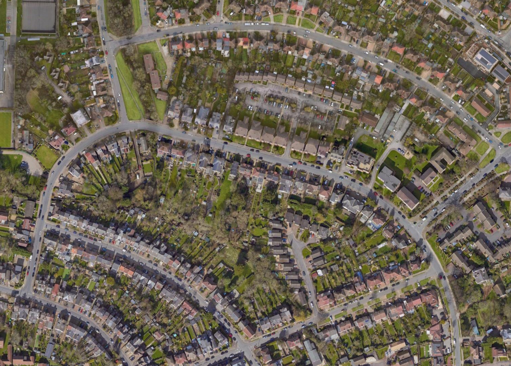
The streets here are largely lined with Victorian terraces, with some grander villas dotted around on larger plots. Sprinkled among these are houses and flats built in the later years as a result of incremental intensification, some on the former gardens of the bigger homes, others on the site of houses destroyed by bombs in the Second World War. : There’s a handful of more recent interventions: nearby, a backland site turned into eight contemporary houses which, of course, Theresa Villiers—our local MP (for the time being)—objected to, and so on.
A typical suburban neighbourhood with deep rear gardens and lots of parking. Most of this area is less than 10 minutes’ walk from New Barnet Station (Google Maps).
Let’s Take a Ride…
Although we’re in Zone 5, trains run into town in less than half an hour; to Moorgate via Finsbury Park and Old Street, and recently our line has been connected to Thameslink, with peak-hour trains connecting commuters with the Elizabeth Line at Farringdon and on to southeast London. It’s a convenient place to live.
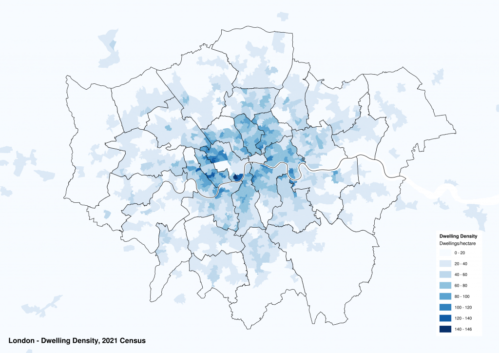
But, having said all of that, New Barnet—and other parts of suburban London just like it—simply aren’t that dense. Pockets of new development have been snuck into redundant land, former garages and car parks, derelict pubs and disused warehouses, and even so, the most recent Census data from 2021 tells us that the density of this part of north London is just 18 dwellings per hectare (dph). Maida Vale, as a comparison, has a density of more than five times that. And Maida Vale is hardly somewhere you could describe as an unpleasant place to live.
Whichever way you look at it, suburban London can clearly do more to meet the city’s housing needs.
A map of London showing residential densities in dwellings per hectare.
The shortage of housing in London is at crisis levels and manifests itself in many ways. Young people have been particularly badly hit, and the consequences for our economy and society are dire. In Hackney, schools are closing because young couples are unable to afford to start families. Homelessness is at record levels, with one in ten children in parts of London classed as effectively homeless. Median house prices in the capital are now 14 times average incomes while wages have stagnated. While this cannot be entirely blamed on our inability to build enough homes, it certainly plays a very large part.
Land in London is precious, yet the suburbs have a hegemony over it. Those lucky enough to own a house in the suburbs and, in particular, those living close to public transport, surely have a moral duty to allow more housing to be built around them so that others can benefit from convenient access to all of the amenities that the city has to offer.
So where might these houses go? Do we have the space? And how can we encourage intensification to happen?
Diminishing Ambitions
The current Mayor of London’s strategic plan for the city, the “London Plan”, was finally adopted in 2021 it set ambitious targets for new homes across the city, compelling each of the planning authorities to meet specific annual housing targets both, with a proportion of these to be delivered on small sites, that is any plot with an area of less than 0.25ha (about a third of a standard football pitch).
An early consultation version of the Plan was accompanied by a series of policies which provided a framework for intensification, clearly stating that boroughs needed to accept that “local character evolves over time” and that it would “need to change in appropriate locations to accommodate additional housing provision”.
I’ve written elsewhere about the push-back from many of the outer-London boroughs to this policy which resulted in the final version eviscerating the small sites targets, and Croydon’s progressive attempts to densify suburban areas that were unceremoniously chucked out by an incoming NIMBY mayor. But even in the short period of time that Croydon’s policy was in place, it resulted in a remarkable outcome, delivering around 2,000 homes within developments of fewer than 10 homes, with house prices and rents levelling off as a result.
So, what if the lessons from Croydon could be repeated across the rest of suburban London? That’s what I’ve set out to establish.
It’s about to get a bit geeky from here on in.
Cum On Feel The (Voro)nois
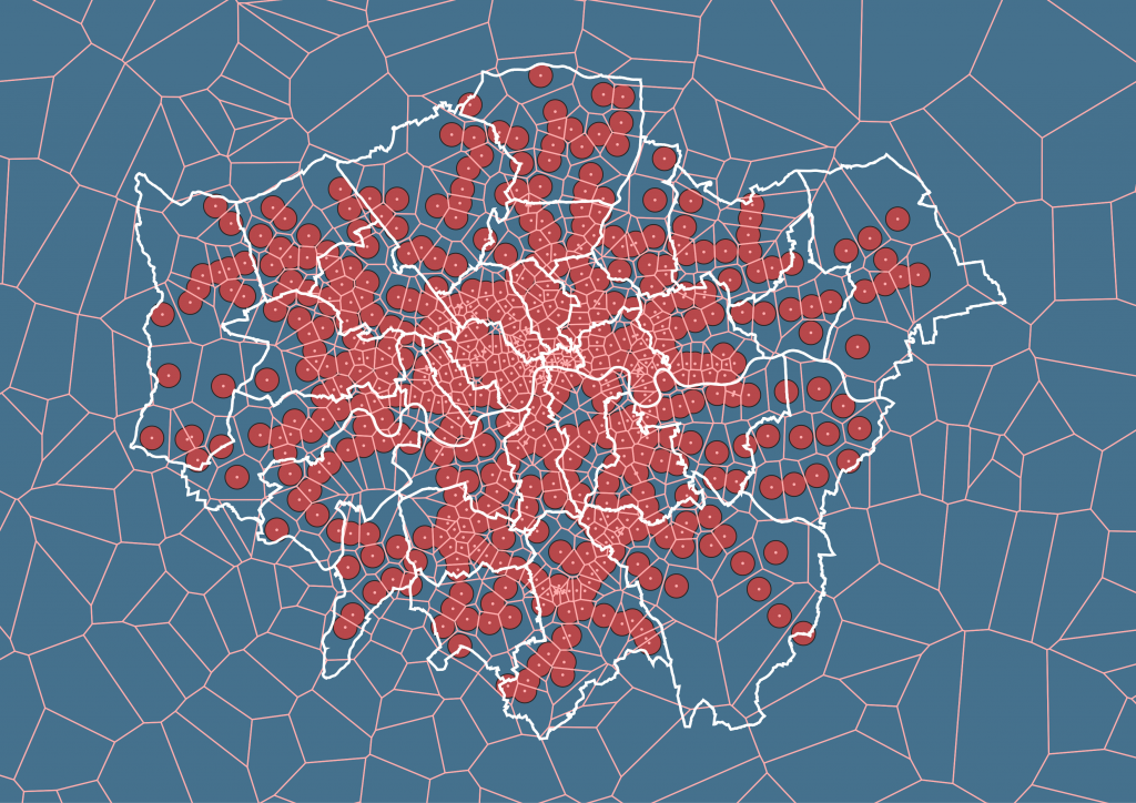
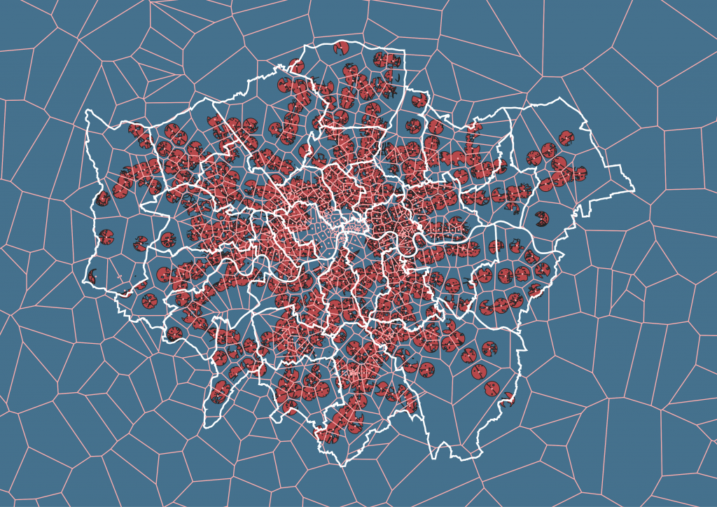
Using a combination of data from Ordnance Survey and Greater London Authority, I assembled a map of London and marked on it every station in the city – both Underground and mainline stations. Many stations are within 800m of each other, so I created Voronoi polygons to establish the closest station to every area in London.
A Voronoi diagram showing every station in London and the areas of the city which are closest to each.
Around each station I created an 800m diameter circle, which equates roughly to a ten-minute walking distance. By combining the two geometries I established the closest station to every area in London that’s no more than ten minutes’ walk away.
A map of London showing every area within 800m of a station.
Clearly this approach doesn’t take into account the various constraints on potential development, including lots of areas which would, of course, be impossible to build on. The Thames, for example, but also areas of protected land such as Strategic Industrial Land (or “SIL”) Locally-Significant Industrial Sites (“LSIS”), green belt and Metropolitan Open Land. There’s a discussion to be had about whether protecting any space close to stations is sensible, and whether golf courses and industrial land might be put to better use. But for the purposes of this exercise, I’ve excluded them; together with parks, gardens, sports pitches and any other type of open space. Given my focus on suburban areas, I’ve also excluded the “Central Activities Zone”, which covers central London. Further refinements exclude a buffer either side of national and regional roads, and existing railways.
The resulting map of London looks something like this:
Excluding surface water, green space, industrial land and the Central Activities Zone, this map shows all the areas in London with potential for intensification.
So now that we have a map showing all of the potential areas that might be intensified around London’s stations, we need to introduce some data which tells us more about the neighbourhoods around them.
Census Sensibility
The 2021 Census provides a huge set of data broken down into geographic zones that enables us, with a bit of mapping jiggery-pokery, to intersect them with our areas of interest.
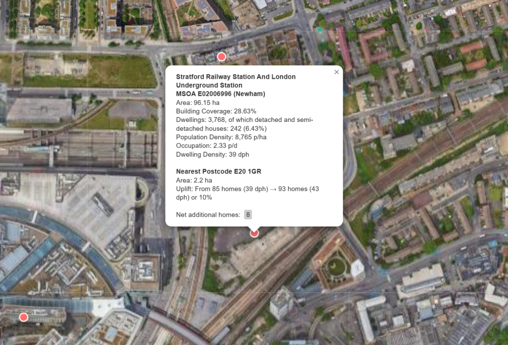
Using Census data broken down by Medium Super Output Area (MSOA) I divided the mapping areas by the equivalent polygon areas. First, though, I ran a series of mapping exercises to establish some additional figures for each of these regions: for example, using Ordnance Survey Zoomstack data to measure the approximate coverage of buildings for each MSOA polygon. Bringing the two together enabled me to examine each of these areas in more detail. Here’s an example: MSOA ref. E02000028 which is located immediately to the west of New Barnet station.
A plan showing the boundary of MSOA E02000028, immediately to the west of New Barnet station.
Measurements taken from GIS tell us that MSOA E02000028 has a total area of 105.61 hectares, and the census data tells us that this contains 2,783 homes (45% of which are detached or semi-detached houses) – an equivalent density of about 26 dwellings per hectare. The footprint of all the buildings is about 18.7% of the MSOA, which makes sense given the large rear gardens, even though there are no large areas of open space within it. The census also tells us that, with a total population density of 62 people per hectare, the occupancy level is only 2.35 people per dwelling…which is surprising given the number of very large houses found here (the highest dwelling occupancies in London tend to be in the East End, with parts of Bethnal Green exceeding eight people per home).
You can see the hatched areas overlaid on the image above, which represent the different Voronoi polygons described early. To the bottom right of the image you’ll find Oakleigh Park station, and this MSOA is divided into three sub-areas, each part closest to a different station: in addition to New Barnet and Oakleigh Park, the north-west corner is within 800m of High Barnet Underground Station.
26 dwellings per hectare is pretty low, although not untypical of suburban London. A modest increase over this area could result in a significant number of new homes – let’s imagine for a moment that this is increased by just 25% (hardly a transformative figure). Yet, even at these modest numbers this results in 686 additional homes – an uplift in density from 26 to 32 dwellings per hectare.
Even 32 dwellings per hectare is pretty modest when compared to other parts of London. MSOA E02000589 covers the area around High Street Kensington, topping out at 137 dwellings per hectare (dph). This is probably a bit much for Zone 5, but Herne Hill (MSOA E02000642) achieves a density of 40 dph and can hardly be considered overcrowded.
With all of this in mind, I’ve established a few rules to apply to my data to try and estimate what a modest uplift in density might achieve. Arguably, nowhere in London that’s within 800m of a station should have a density of less than 40dph, so I’ve set that as a minimum. And, although some parts of the capital exceed this, I suggest that the increase in density should not push an area beyond 100dph. Within these thresholds, I’ve set a few additional rules: where detached and semi-detached houses form more than 40% of the total dwellings, I’ve set the potential density increase at 50%; where they’re less than 10% of the total housing stock, it’s 10%. For everything else I’ve assumed a 25% increase.
I’ve made a further adjustment where buildings cover less than 25% of the available land, adding a compound increase of 40% to this figure. The resultant algorithm is something like this (where “familyHouses” means a semi-detached or detached dwelling):
# First, calculate the initial uplift in density based on the proportion of "family homes"IF familyHouses > 40% THEN newDensity = existingDensity x 1.5
ELSE IF familyHouses < 10% THEN newDensity = existingDensity x 1.1
ELSE newDensity = existingDensity x 1.25
# Then add a compound density based on the total percentage coverage (footprint) of buildings over the MSOA areaIF coverage < 20% THEN newDensity = newDensity x 1.4
# Finally, if the new density exceeds 100 dph, cap the increase to this level (this means that any areas that already exceed 100dph see no increase)IF existingDensity > 100 THEN newDensity = existingDensity
ELSE IF newDensity > 100 THEN newDensity = 100
ELSE IF newDensity < 40 THEN newDensity = 40
Applied across the entire city, this results in a net increase of some 900,000 homes, with each of the boroughs seeing the following uplift:
Borough
Net New Homes
Barking & Dagenham
15,070
Barnet
54,129
Bexley
37,985
Brent
32,719
Bromley
68,426
Camden
8,625
Croydon
67,165
Ealing
34,616
Enfield
57,520
Greenwich
28,739
Hackney
10,886
Hammersmith & Fulham
9,755
Haringey
18,646
Harrow
39,122
Havering
33,385
Hillingdon
47,922
Hounslow
27,313
Islington
7,336
Kensington & Chelsea
5,537
Kingston upon Thames
27,862
Lambeth
16,601
Lewisham
31,801
Merton
23,681
Newham
26,094
Redbridge
31,856
Richmond upon Thames
31,589
Southwark
17,817
Sutton
32,490
Tower Hamlets
11,633
Waltham Forest
21,822
Wandsworth
15,593
Westminster
5,040
Total
898,776
Unsurprisingly, those boroughs with the largest area see the greatest net increase in new homes, with Bromley at the top with 68,426 new dwellings, and Croydon slightly behind with 67,165. The inner London boroughs such as Camden, Kensington & Chelsea and Westminster see the least. The City of London is at zero and doesn’t appear in this table because it’s entirely within the Central Activities Zone and excluded as a result.
It’s important to remember that the figures I’ve listed above are limited to those areas within 800m of a station. That means there’s a lot of outer London excluded from my estimates, but imagine that we increase the density here as well, perhaps by a more modest amount…there would surely be many more thousands of homes that could be built in addition to the 900,000 I’ve suggested above.
Due to limitations in the mapping data, there are some anomalies which skew the figures in a few areas. For example, the Ordnance Survey mapping data doesn’t identify football stadia within its “sites” geometry, and while I’m ambivalent about the so-called beautiful game, and would be quite happy for every football stadium in London transformed into housing, I’m not sure Arsenal fans are quite ready for the Emirates Stadium to go the same way as their former ground just yet.
Using this methodology, the Emirates Stadium is identified as a location for intensification; Arsenal’s previous ground can be seen in the top right of the image, which was converted into homes after the club moved to its new location in 2006.
There’s also no adjustment made for those areas subject to wider regeneration schemes or empty sites. The large car park to the east of Stratford Westfield, which was going to be the home of London’s version of the Madison Square Gardens’ Sphere has an area of around 2.5 hectares and could feasibly provide 200-300 homes, but my methodology only shows an uplift of eight, as the density calculation is based on the entire MSOA area rather than this small section of it.
There are some other issues which could do with refinement. The MSOA boundaries do not take into account the type of space within them so, for example, with two polygons of equal size might have varying levels of undevelopable space. The total number of existing dwellings might be the same in both cases, and therefore the overall density would be shown as equal, however in reality the same number of homes could be crammed into a smaller area. This would mean that the impact of intensification would be more profound in the latter.
In reality, though, I’m not sure these anomalies make much of a difference overall as they seem to balance out across the wider picture.
So, these oddities aside, what does suburban intensification look like when applied to largely residential neighbourhoods?
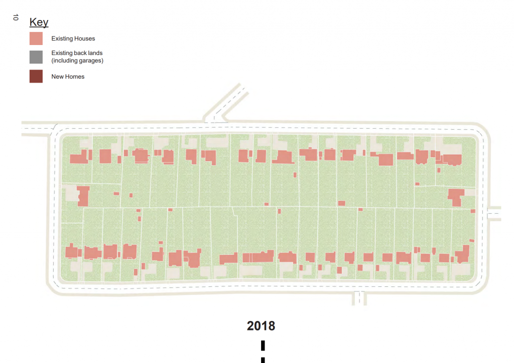
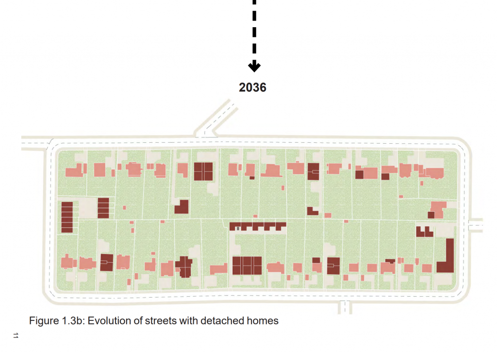
The guide provided a series of simple diagrams which mapped out the evolution of suburban blocks to show how, over an 18-year period, infilling gap sites and the replacement of some large houses with a combination of flats and houses. Let’s take a look at these to see what this means in numerical terms.
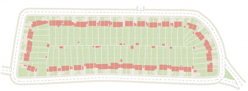
The first extract, below, shows a typical suburban block of detached houses. In the top example (2016) there are 37 detached houses. Although the plan is supposed to be a generic example, it’s almost certainly based on a real part of Croydon. There are large rear gardens and gaps of varying widths between the houses themselves.
In the “evolved” condition of 2036, several of the houses have been replaced with new buildings, and some have had new homes erected in rear gardens. From this plan it’s impossible to count the new number of dwellings that might be delivered in this way (it’s not really the point of the drawing), but the drawing does attempt to show the subdivision of the new buildings into the individual demises. Assuming nothing is taller than three storeys, I count at least 50 new homes, including a mix of houses and flats—and 29 of the original houses remain. In total, that’s a doubling of density – and it can hardly be said that the character has changed beyond all recognition: the large rear gardens largely remain and the coverage of buildings relative to undeveloped space is minimal.
This demonstrates that the kind of intensification we’re talking about is entirely achievable, and any objection on the basis of unacceptable change in character is for the birds.
Such an approach is entirely possible if we’re prepared to implement to bold policy reforms needed to enable this kind of development to come forward. In the brief period between the Croydon SPD being adopted in 2018, and it’s unceremonious scrapping in 2022, there was a remarkable uptick in small site development across the borough. The GLA’s annual Housing in London report shows that during this time Croydon delivered (delivered, not just approved) nearly 2,000 homes within developments consisting of fewer than 10 homes: more than three times the next highest, Barnet.
It’s time to adopt a London-wide policy which encourages similar levels of development across all of London’s suburbs. We know we need the homes. We now know we have the capacity. Let’s get on and do it!
You can have a play with my online map showing all areas of suburban intensification by clicking the image below.
In comparison to other similarly-sized world cities, London is not very dense. With limited exceptions, such as Maida Vale, parts of Tower Hamlets and Kensington, much of the city has no more people per hectare than the satellite towns surrounding it. Arrive by train and this is only too apparent, with railways cutting through miles of two-storey Victorian terraces, only giving way to mansion blocks, high rise towers and high-density housing estates close to the heart of the city. Our housing is too thinly spread.
All land in London is a precious resource, and to sustain our capital’s economy and vitality we have to use it more effectively—and more fairly.
Living in any major city—and benefiting from all of the amenities and conveniences that it has to offer—comes with a moral responsibility to allow others to do the same. London’s suburbs in particular could do much more to help provide the homes that the city so desperately needs—no more so than in those areas which benefit from good access to the public transport network, and where reliance on private car ownership diminishes.
But in outer areas which have not been identified for large-scale regeneration, the process of intensification can be a tortuous one. Obtaining permission to build even a small development of new homes is disproportionately complex, time-consuming and risky when compared to larger strategic developments.
Yet, even within existing planning policies, all the tools exist to establish an environment where land seemingly lost to low-density housing can actually be reinvigorated through a process of gradual densification.
Focusing on areas within a ten minutes’ walk of the city’s suburban train and Underground stations, there is the potential for up to a million new homes to be built, surprisingly quickly and effectively.
When Mayor of London Sadiq Khan’s London Plan was adopted in 2021, it set out, for the first time, housing targets that must be achieved on small sites in each of the London boroughs, the City of London Corporation and two Mayoral Development Corporations. In this case, small sites were defined as anything with an area of less that 0.25 hectares—roughly a third of a standard football pitch. Accompanying these targets was guidance and policies on how such development should be encouraged through plan-making and decisions.
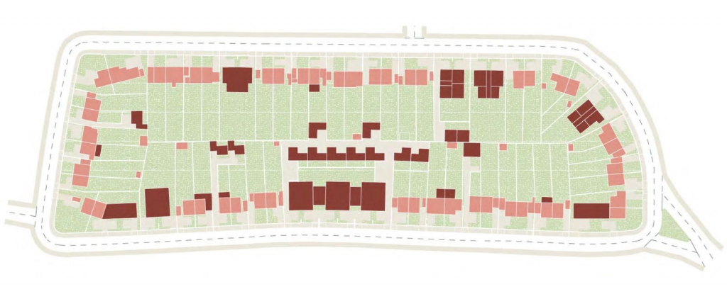
Although it didn’t become formal policy until 2021, Khan’s version of the Plan had first been published in draft form at the tail end of 2017. The boroughs either embraced or resisted the Plan’s ambitions largely depending upon their political persuasion at the time. Labour-run Croydon Council, on the southern edge of the Greater London area, was one of the first out of the blocks, quickly establishing a set of planning principles to be followed by applicants wishing to bring forward small-scale development in suburban areas—generally towards the southern border with Surrey. It’s award-winning Suburban Design Guide was adopted in April 2019, and provided clear parameters for the transformation of large, land-hungry houses into efficient, mid-rise developments. Essentially, as long as developers followed the rules established by the guidance, there would be no reason for their applications to be rejected. Some examples provided within the document demonstrated how, for example, a pair of adjoining large houses could be turned into as many as 20 to 30 new homes.
Extract from Croydon’s Suburban Design Guide.
Five years on from the adoption of the guidance, which was scrapped in 2022 by the incoming Conservative mayor, there is sufficient data to demonstrate the effect this policy had on housing delivery—and the figures are remarkable. In the four-year period between 2018 and 2021, Croydon managed to complete nearly 2,000 new homes on small sites within developments consisting of fewer than ten dwellings (noting that even this is below the London Plan’s small site threshold, which determines plot size but not the number of homes within it). The next highest delivering borough was Barnet, which in the same period delivered around a quarter of this figure.
The Suburban Design Guide neatly illustrated how larger areas of suburban housing could be intensified incrementally, resulting in a broader mix of smaller flats, townhouses and large family homes. This approach is borne out by the number of homes delivered in Croydon during a relatively short period of time: around 500 per year. There are 20 outer-London boroughs including Croydon. If the remaining 19 had managed to deliver housing on small sites at the same rate, we could have had another 25,000 homes built by now.
The Croydon experience provides a useful model for how suburban intensification might be achieved across the rest of the city. There are numerous benefits to this approach, in addition to the sheer number of new homes that could be delivered this way: smaller developments tend to rely more heavily on local supply chains, so can help reinvigorate local economies, providing jobs, skills and training. And, by reducing the barriers to entry through the mitigation of planning risk, developers are able to invest in better quality, more sustainable homes that meet local need—and significantly faster than large-scale housebuilding. The inclusion of policies which limit the net loss of family homes can also ensure that diversity of housing stock is maintained.
Our research has shown that implementing a similar policy across the whole of London’s suburbs within 800m of a station could enable the delivery of between 850,000 and a million homes through a modest uplift in density of just 25%, assuming no lower than 40 dwellings per hectare (dph), and no higher than 100dph. Even at this modest level, which would involve limited disruption to existing communities, the potential gains are huge.
The recent investigation by the Competition Markets Authority into housebuilding identified planning uncertainty as a significant barrier to the delivery of a new homes, and in particular, to the entry of small-scale developers into the market, stating that there is “evidence that problems in the planning systems may be having a disproportionate impact on SME housebuilders.”
Providing certainty through the planning system has to be a key tenet of any drive to improve housebuilding. A strong presumption in favour of development close to existing stations in urban areas would help in this regard, backed by clear and unambiguous guidance on what types of development would be acceptable, including clarity on building heights, privacy distances, overshadowing and access to natural daylight, and so on.
The 2017 draft London Plan stated that within close proximity to stations and town centres, “there is a need for the character of some neighbourhoods to evolve to accommodate additional housing. Therefore, the emphasis of decision-making should change from preserving what is there at the moment towards encouraging and facilitating the delivery of well-designed additional housing to meet London’s needs.” This text was expunged from the adopted version. Words to this effect should now be included within the National Planning Policy Framework, making an exception for areas protected by other heritage designations, such as conservation areas and proximity to listed buildings and so on. This direction should be accompanied by an instruction that local planning authorities develop clear design guidance to assist in the delivery of new homes on small sites. If they do not, then a default set of guidance should be established for applicants to fall back on until such time as this in put in place.
Suburban intensification is tricky, and alone will never be able to deliver all of the homes that the country needs. But experience from Croydon has demonstrated that when the right conditions are in place, it can be implemented quickly, and at scale. As the country recovers from a long period of stagnation, this is one way that we can not only build the homes we need—quickly, where they’re most needed—but also promote economic growth.
When the latest iteration of the London Plan was adopted in 2021, for the first time in its 20-year history the policy demanded that the capital’s 35 planning authorities deliver a proportion of their overall housing targets on small sites – that is, with an area of no more than 0.25ha. The figures varied across the city, but the total number of homes to be found on these pockets of land stood at 120,000 – just under a quarter of the overall housing target for the whole of London.
This number was way below that originally proposed by the London mayor in 2018. Alongside a ‘presumption in favour’ of development on small sites close to public transport, the earlier version of his plan compelled planning authorities to find space on small sites for a quarter of a million homes, with the outer boroughs expected to deliver the lion’s share.
The pushback was inevitable, with London Assembly member Andrew Boff claiming, hyperbolically, that this amounted to a ‘war on the suburbs’. With the GLA lacking convincing data to demonstrate the figures were achievable, the targets were slashed before adoption.
But quiet, in the background, progressive boroughs knuckled down and got on with putting plans in place to promote intensification. In 2020 – nearly a year before the final version of the London Plan was adopted – Lewisham Council appointed RCKa and Ash Sakula to prepare dedicated guidance for new homes on its small sites. Just six months after the London Plan became official policy, Lewisham’s Small Sites SPD was formally adopted.
Two years on, as Sadiq Khan looks towards what’s increasingly likely to be a third and final term, he will be considering updates to the London Plan to cement his legacy as the mayor who did the most to tackle the city’s profound housing crisis. Small sites are likely to be a key focus of this work, and it would be a shrewd move to ramp up the small sites targets accordingly. But the question remains over whether there is sufficient data to justify this increase. To counter resistance to suburban intensification (as happened in Croydon) the new plan will need to be backed with robust evidence of the quantity and distribution of these sites.
So where are they? And how many? We tried to find out.
Land Registry data tells us that there are some 66,000 freeholds in Lewisham, and about 85 per cent of these meet the small-site criteria. Armed with our intimate knowledge of the Lewisham SPD and the site “types” it identifies, we set about mapping every one of them. Having built up a vast library of sites, based on the SPD, we trained an AI to categorise a bunch: backland, infill, amenity space and so on. Then, setting our learning model on the remainder of the borough, we created a complete map of Lewisham, including the location, size – and a rough idea of capacity – of every development opportunity from Deptford to Beckenham.
What we found was striking. While Lewisham’s London Plan 10-year small sites target is currently 3,790, based on early outputs from our data we think there might be capacity for two to three times this number. In fact, our AI model shows that there are enough sites to deliver Lewisham’s target on just two types alone. And as we trawl through the data, the AI improves. Ultimately, our plan is to apply the learning model to capture the whole of London.
Now, just because a site is developable it doesn’t mean it will come forward. The AI makes no distinction between public and private ownership, and many of the sites it has picked out will not provide new homes: some are private gardens, others active builder’s yards and occupied garages. But by establishing a policy landscape that makes planning less risky – as Lewisham has done – boroughs can go a long way to meeting these targets.
Extrapolating these figures across the rest of London, we think there’s sufficient capacity for at least 350,000 homes. Backed by our AI, there can be no more arguing over targets when we know not just how many sites there are. We can even point to them on a map. This is a huge opportunity, and those boroughs still lacking a dedicated small-sites policy should be compelled to implement it as soon as they can. It’s time to take small sites seriously.
This describes a typical limited tender process using standard methods of price / quality measurement, with a pricing ratio set at 50%. It demonstrates that this scoring ratio will almost certainly result in the cheapest price winning the project, even with a very low quality score.
The sample scores used to test this model is as follows:
Bidder Name
Fee (£)
Quality Score (Out of 100%)
Practice A
102,450
82
Practice B
78,000
75
Practice C
125,150
85
Practice D
98,500
68
Practice E
25,000
25
Practice F
107,000
76
Note that the scoring for Practice E has deliberately been set very low, scoring just 25% for quality but also coming in at less than a third of the next cheapest bid. Unfortunately, such wild variations in price scoring are not unusual when bidding for public sector work. There are few other sectors where any sensible person would accept a tender which was so much lower than the broad average of others; yet, for architectural services, such low-ball bidding is common—and rarely rejected, despite the Public Contract Regulations allowing commissioning bodies to reject “abnormally low” bids. Given that architectural salaries are broadly similar, the only explanation for low fees is that the bidding practice is anticipating spending far less time working on the project than others. There are no innovations in the market which enable practices to significantly reduce the cost of delivering their services without reducing amount of time spent performing it, and therefore the quality of the design which derives from these efforts.
For the purpose of this exercise, the most expensive practice has also scored the highest for quality. This is useful to demonstrate how different scoring methods can achieve a reasonable balance between quality and price, delivering best value for the client.
The following sections explore different methods of scoring and, using the figures above, illustrates how different ratios and scoring methods result in very different outcomes.
Relative to Cheapest Method of Scoring
In our example, the lowest financial bid was £25,000, and the highest £125,150. Scoring was based on a quality / cost ratio of 50:50.
The highest quality score was 85% which, when adjusted to the quality ratio of 50%, results in a quality component of 42.5%.
Using this method of scoring, Practice E (the cheapest) is the winning bidder. Clearly, any practice securing work with a fee of less than a third of the nearest bidder is either going to be unable to service the project properly or will be making a significant loss. Nobody in their right mind would accept such a low tender from, say, a builder, as clearly the quality of the work would be commensurately poor. Yet this happens all the time when it comes to commissioning architectural services.
Ranking
Bidder Name
Fee (£)
Price Score (%) (max. 50.00)
Quality Score (%) (max. 50.00)
Total Score (%)
1
Practice E (WINNER)
25,000
50.00
12.50
62.50
2
Practice B
78,000
16.03
37.50
53.53
3
Practice A
102,450
12.20
41.00
53.20
4
Practice C
125,150
9.99
42.50
52.49
5
Practice F
107,000
11.68
38.00
49.68
6
Practice D
98,500
12.69
34.00
46.69
Out of interest, let’s test the same figures using an alternative ratio: 70% quality and 30% price. This gives us the following results:
Ranking
Bidder Name
Fee (£)
Price Score (%) (max. 30.00)
Quality Score (%) (max. 70.00)
Total Score (%)
1
Practice C (WINNER)
125,150
5.99
59.50
65.49
2
Practice A
102,450
7.32
57.40
64.72
3
Practice B
78,000
9.62
52.50
62.12
4
Practice F
107,000
7.01
53.20
60.21
5
Practice D
98,500
7.61
47.60
55.21
6
Practice E
25,000
30.00
17.50
47.50
This result isn’t ideal either, as now the most expensive bidder has won the day, with a quality score that’s only marginally higher than the nearest competitor, but a pricing score which is a fifth higher.
Perhaps this suggests that the relative to cheapest method of scoring is never the best one to use?
Relative to Best Method of Scoring
An alternative way of assessing quality is to award all of the available quality points to the best submission. Having established a shortlist of what are, presumably, the most capable qualifying competitors on the market, it is nonsensical that the cheapest price tender receives the full 50% of the price score, but the best submission does not receive the full 50% of the available points for quality.
It may be that assessors have already given the best submission the full available score for quality, but if not, this method assesses all quality scores relative to the maximum percentage available, as well as giving the maximum marks for price to the cheapest bid. In other words, the best quality submission receives the whole 50% available, with all the remaining scores calculated proportionately to this.
It goes some way to preventing the cheapest bid “buying” a project with an inferior submission accompanied by an abnormally low financial submission—but does it ensure that the client is receiving the best value for money?
In this example, and using the same 50:50 ratio, Practice E still wins, having scored 50.00% for price and 14.71% for quality. So, pursuing this method doesn’t seem to make much difference.
Ranking
Bidder Name
Fee (£)
Price Score (%) (max. 50.00)
Quality Score (%) (max. 50.00)
Total Score (%)
1
Practice E (WINNER)
25,000
50.00
14.71
64.71
2
Practice A
102,450
12.20
48.24
60.44
3
Practice B
78,000
16.03
44.12
60.14
4
Practice C
125,150
9.99
50.00
59.99
5
Practice F
107,000
11.68
44.71
56.39
6
Practice D
98,500
12.69
40.00
52.69
Mean Narrow Average Method of Scoring
The mean narrow average (MNA) method of scoring discounts the highest and lowest tenders, establishing the mean value of those that remain, and scores all tender prices against the closest to that mean value. Fee bids which are less than half, or more than double, the mean value receive a price score of zero.
With Mean Narrow Average scoring, bidders are compelled to identify the appropriate fee required to service the project rather than cutting prices to buy the job, which could lead to underperformance or claims for additional fees later in the programme. Excessively low—or high—fees are penalised.
For these pricing figures, the mean (average) bid, including the lowest and highest fee submission, was £89,350, and the median was £100,475.
The highest and lowest fee bids have been excluded when calculating the mean average.
Using Mean Narrow Average with a price ratio of 50% results in Practice A being the winning bidder. Intuitively, that seems like a reasonable result: Practice A scored very close the median score (there were two more expensive bids, and three cheaper ones), and scored second highest in terms of quality. The full rankings are as follows:
Ranking
Bidder Name
Fee (£)
Price Score (%) (max. 50.00)
Quality Score (%) (max. 50.00)
Total Score (%)
1
Practice A (WINNER)
102,450.00
46.91
41.00
87.91
2
Practice D
98,500.00
48.96
34.00
82.96
3
Practice F
107,000.00
44.55
38.00
82.55
4
Practice B
78,000.00
40.42
37.50
77.92
5
Practice C
125,150.00
35.15
42.50
77.65
6
Practice E
25,000.00
0.00
12.50
12.50
Alternative Ratios
To test a few alterative scenarios, I’ve run the same figures as above, but using different price/quality ratios. In most cases, the outcome is the same: Practice A wins, right up to the point where price comprises just 10%. Then, the highest scoring quality submission—and the most expensive bid—is the one that’s successful.
This means that the use of Mean Narrow Average is probably best deployed with a quality/cost ratio of around 60% – 70%.
Quality: 60%, Price: 40%
Ranking
Bidder Name
Fee (£)
Price Score (%) (max. 40.00)
Quality Score (%) (max. 60.00)
Total Score (%)
1
Practice A (WINNER)
102,450.00
37.53
49.20
86.73
2
Practice F
107,000.00
35.64
45.60
81.24
3
Practice D
98,500.00
39.17
40.80
79.97
4
Practice C
125,150.00
28.12
51.00
79.12
5
Practice B
78,000.00
32.34
45.00
77.34
6
Practice E
25,000.00
0.00
15.00
15.00
Quality: 70%, Price: 30%
Ranking
Bidder Name
Fee (£)
Price Score (%) (max. 30.00)
Quality Score (%) (max. 70.00)
Total Score (%)
1
Practice A (WINNER)
102,450.00
28.15
57.40
85.55
2
Practice C
125,150.00
21.09
59.50
80.59
3
Practice F
107,000.00
26.73
53.20
79.93
4
Practice D
98,500.00
29.37
47.60
76.97
5
Practice B
78,000.00
24.25
52.50
76.75
6
Practice E
25,000.00
0.00
17.50
17.50
Quality: 80%, Price: 20%
Ranking
Bidder Name
Fee (£)
Price Score (%) (max. 20.00)
Quality Score (%) (max. 80.00)
Total Score (%)
1
Practice A (WINNER)
102,450.00
18.76
65.60
84.36
2
Practice C
125,150.00
14.06
68.00
82.06
3
Practice F
107,000.00
17.82
60.80
78.62
4
Practice B
78,000.00
16.17
60.00
76.17
5
Practice D
98,500.00
19.58
54.40
73.98
6
Practice E
25,000.00
0.00
20.00
20.00
Quality: 90%, Price: 10%
Ranking
Bidder Name
Fee (£)
Price Score (%) (max. 10.00)
Quality Score (%) (max. 90.00)
Total Score (%)
1
Practice C (WINNER)
125,150.00
7.03
76.50
83.53
2
Practice A
102,450.00
9.38
73.80
83.18
3
Practice F
107,000.00
8.91
68.40
77.31
4
Practice B
78,000.00
8.08
67.50
75.58
5
Practice D
98,500.00
9.79
61.20
70.99
6
Practice E
25,000.00
0.00
22.50
22.50
Out of interest, what happens is we reverse the ratio to prioritise cost over quality, using the Mean Narrow Average scoring method? Well, here we go:
Quality: 20%, Price: 80%
Ranking
Bidder Name
Fee (£)
Price Score (%) (max. 80.00)
Quality Score (%) (max. 20.00)
Total Score (%)
1
Practice D (WINNER)
98,500.00
78.33
13.60
91.93
2
Practice A
102,450.00
75.06
16.40
91.46
3
Practice F
107,000.00
71.28
15.20
86.48
4
Practice B
78,000.00
64.67
15.00
79.67
5
Practice C
125,150.00
56.24
17.00
73.24
6
Practice E
25,000.00
0.00
5.00
5.00
Surprisingly (at least to me), Practice A still scores very highly, coming second to Practice D which had a similar, but slightly lower price, but the second-to-bottom quality score. Nobody in their right mind would advocate for the commissioning of architectural services based on such a skewed ratio, but this serves to demonstrate that our earlier conclusion that a quality ratio of between 60% and 70% is likely to yield the best outcome for everyone.
A combination of Mean Narrow Average (MNA) and Relative to Best scoring methods could also be used, i.e. where the price score is calculated as the MNA result with the highest quality score receiving all of the points available, but given the success of the simple MNA method, it’s probably unnecessary.
All of these figures have been generated using a live model which you can test with different figures of your choice, here. And if you’re a procurement officer or public client, try putting so real-life tender figures you’ve received into this too, and see whether the outcome would have been any different.
Addendum
After posting this article on LinkedIn, I’ve been directed to a comprehensive analysis of the various pricing models available to the public sector, written by Rebecca Rees of Trowers & Hamlins, which sets these out far more comprehensively than I could ever hope to do.
You can download the document using the button below.
No aspect of planning policy is quite as divisive, or as misunderstood, as the green belt. Covering some 16,000km2, England’s 14 green belts occupy one-eighth of England’s total area (equivalent to three-quarters of the area of Wales, if that’s your preferred unit of measurement).
London’s metropolitan green belt alone stretches from Haslemere in Hampshire to the North Sea—a distance of some 100 miles—and with an area of over half a million hectares is over three times larger than the city itself.
Although its origins precede the Second World War, the green belt was formally established by the Town and Country Planning Act of 1947, which allowed planning authorities to protect open space with this designation. And while the policy has been extremely successful in achieving its original objective of constraining urban expansion, three-quarters of a century on, it’s surely time to reform this anachronistic policy and ensure it meets the needs of the modern world.
Among the marshes of estuary Essex and the undulating hills of Hampshire, there are motorways, waste transfer depots, landfill sites, distribution centres, poultry farms, golf courses and car parks that are all protected from development by the simple virtue of their presence within the green belt. Many areas of otherwise undeveloped space are of limited quality too.
One of the most prominent obstacles to a sensible discussion is the fact that the arguments for and against the green belt have become so utterly polarised. Listening to both sides of the debate, you’d be forgiven for thinking that we face a simple binary choice between the preservation of dwindling landscapes and concreting over every last inch of them. And yet, the green belt has actually grown in recent years. It’s preposterous to claim that it’s under threat.
While we can’t lay the blame for our pitiful national productivity solely at the feet of green-belt policy, it’s clear that our inability to build – whether it’s homes, railways or solar farms – in the places we need, is partly a product of misplaced constraints on development.
Lobby groups like the Campaign for the Protection of Rural England (CPRE) insist that any rethink of the green belt isn’t necessary, but these claims simply don’t stand up to scrutiny. Its latest State of Brownfield report confidently concluded that 1.2 million homes could be built on brownfield land alone, but this is only a quarter of the current shortfall, and certainly insufficient to meet future demands. Furthermore, many of the areas it proposed for new housing aren’t even in the places where need is most acute. I’m not aware of many CPRE members upping sticks from leafy Surrey to the post-industrial wastelands of northern Britain.
There’s a common misconception about the purpose of the green belt in the public sphere, with many mistakenly believing that its purpose is to protect precious rural landscapes. Close to where I live, campaigners against the Cockfosters car park development argued that planning permission should be refused because it would be visible from the green belt, as if the prospect of catching a glimpse of it whilst hurtling along the M25 was a prospect so horrific it didn’t bear thinking about.
In a poorly researched article in the Guardian, Simon Jenkins recently pondered why there wasn’t the same level of protection for the country’s rural parts in the same way that our cities are preserved by Conservation Areas. Any architect or planner could have pointed him towards a whole bunch of protections: AGLV, AONB, Ancient Woodland, SSSI, Ramsar and National Parks, to name a few. Rural areas in fact benefit from far more protections than our towns and cities do, but this is indicative of a wider misunderstanding of planning policy, where green belt is wrongly conflated with other designations that actually do pertain to landscape quality and biodiversity.
It is true that too many open spaces have been relinquished to low-quality, car-dependent sprawl, and nobody – other than the volume housebuilders – wants to see more of that. But, despite what the CPRE claims, we cannot build the homes our country needs on brownfield alone, so some release of open space is inevitable and probably desirable.
There’s a compelling argument that green-belt policy is actually damaging the valuable open spaces that the CPRE is keen to protect. Because building homes is so difficult in places with large areas of green belt, developers target sites beyond it, creating their unsustainable car-dependent sprawl on the outskirts of settlements instead.
Likewise, building new homes on brownfield land far from public transport makes little sense when we could instead cluster them around stations in rural areas, and as an added bonus, give millions of families convenient access to the countryside – something the CPRE claims to support. Not that this should be a free-for-all. Any release of green-belt land for development must be accompanied by robust masterplanning and design codes to ensure that when land is set aside, it is done in a way that is sustainable, accessible, and responsive to local character.
The amount of green belt that would need to be lost to provide a million new homes is so small that it’s little more than a rounding error. Even with modest densities, we’d lose just 1 per cent of the green belt to deliver a million homes. That’s a price worth paying.
Labour’s recent pronouncements in this respect are welcome – if vague . But there are encouraging signs from planning authorities, such as Enfield, that are prepared to tackle this challenge head-on. And emboldened by a lacklustre field of opposition candidates, the mayor of London might revisit his blanket opposition to green-belt release in the next iteration of his city-wide spatial plan. We can but hope.
It’s surely time to set ideology aside and face the fact that an evidence-based review of green-belt policy is long overdue. If we’re to have any chance of facing the challenges of the coming decades, we need to roll up our sleeves and, maybe, loosen our belts.
Perhaps we’ve been desensitised to the stark realities of the housing crisis, with the ‘keep calm and carry on’ attitude of the baby boomer generation (which, we need to remember, lived through very little genuine hardship in the post-war years) prevailing. But in other any functional democracy where 3.6 million young adults remained at home due to generational housing inequality, this would be a national scandal. According to some estimates, we are millions of homes short of where a country with our population should be.
The fact that none of the mainstream parties have yet to articulate a plan to address this crisis is a damning indictment of current political discourse. Not only is this a social failure, it’s an economic one too. Productivity in the UK is woefully low, with young people unable to relocate to where jobs are, or otherwise struggling with extended commutes. Worse still, a generation is delaying starting families as housing costs, employment precarity and overcrowding threaten to detonate a demographic time-bomb which nobody seems willing to defuse.
I live on the northern fringes of London, the final stop before the railway plunges into the capital’s green belt. In less than 30 minutes I can be in central London, on one of six or more trains that run every hour. There are many similar lines that extend out of London, providing convenient access both to the city and countryside for those who live close to them. It’s difficult to think of more appropriate locations for new homes.
Resistance to urban expansion is often (rightly) based on a fear of perpetuating low-density, car-dependent sprawl on the outskirts of our rural towns and villages. So it follows that, in order to create new homes less dependent on private vehicle ownership, we should instead look to optimise development around existing public transport networks. But how many homes might we build? And where?
Using various publicly-accessible data sources, I mapped every train station in England and examined the constraints on development around each. Anywhere at risk of flooding was excluded, as was land within national parks, existing urban areas, or those sites protected by landscape designations because of their quality or scientific interest. Green belt, though, I considered fair game: regardless of what the CPRE claims, it’s increasingly clear that we cannot deliver the homes we need on brownfield alone, and a pragmatic review of green belt policy is long overdue. Drawing an 800m radius around each station (equivalent to a 10 minute walk) and extracting constraints, I arrived at a pleasing 777 stations with development potential.
Not every one is close to a population centre, and some are used by only a handful of passengers each year. As there’s no easy method of measuring current or potential frequency of service, I pegged target densities to passenger annual numbers. Those stations closest to major cities were assigned 75 homes per hectare, those in remote areas much less. But even at modest densities this reveals a huge potential for delivering the new homes we need.
A case in point: Ashwell & Morden sits mid-way between London and Cambridge, with frequent services to both. Yet look at it on Google Maps and you’ll see the station is surrounded by little more than open fields. It’s not even in the green belt of either city. Even at modest densities, this site could accommodate 7,000 homes for some 30,000 people. Development of this scale, supported by a decent masterplan and robust design coding, could provide social infrastructure and sustainable travel for residents. And rolling out a similar approach to the rest of the country could be transformational in providing high-quality homes in sustainable locations such as this.
The familiar complaint from those in comfortable circumstances that we risk ‘concreting over the countryside’ doesn’t stand up to scrutiny when – even with these additional numbers – we’d lose less than 0.4 per cent of England’s rural space in the process (Britain’s roads take up around three times this area).
The coming general election could be a turning point in whether we take genuine steps to address generational inequality, particularly in respect of housing delivery. Building homes around rural stations won’t go the whole way to achieving this but, combined with other bold ideas, it could play a part.
Announced with considerable fanfare in 2018, and becoming formal planning policy the following year, Croydon Council’s Suburban Design Guide supplementary planning document (SPD) was London’s first – and, even now, most ambitious – attempt at encouraging its woefully sparse outer areas to do more to meet the city’s housing needs.
The publication made no bones about its intentions. “The evolution of the suburbs to provide homes that will meet the needs of a growing population,” its introduction stated. It went on: “It must however be recognised that delivering approximately 10,000 homes in the suburban places of Croydon will result in an evolution of the existing character of suburban streets, and that the increased density of homes can impact on the amenity of existing residents if not properly managed.”
The guide was rightly heralded as a progressive and practical attempt to deliver new homes in those places best able to accommodate them, and it was quickly celebrated as an exemplar for how to sustainably densify the city’s fringes. Croydon’s in-house spatial planning team took home a planning award in 2019 and the guide was highly commended at the New London Awards the same year. From a personal point of view, it was an important reference for my architectural practice’s own small sites SPD in Lewisham, which was adopted by the council a year ago this month.
However, just three years on, Croydon’s Suburban Design Guide is no more. In May, the borough’s voters elected Conservative Jason Perry as their first Mayor. He had promised that one of his first acts if he won would be to revoke the “dreaded” SPD, which he claimed has “destroyed” Croydon’s character and led to the “destruction” of homes – a peculiar claim given the huge number of dwellings it had in fact enabled in a relatively short time.
The SPD had been produced in response to Sadiq Khan’s London Plan, which was first published in draft in 2017 but not formally adopted until March 2021. The Plan enshrined the need for the boroughs to consider the importance of small sites in meeting London’s housing needs. For the first time, every London planning authority was tasked with finding ways to encourage development on sites with a total area of less than a quarter of a hectare (roughly one third of a standard football pitch), with a ten-year small-site housing target set out in unequivocal terms.
Not only was this to be a way of delivering much-needed homes, the Plan also acknowledged the importance of nudging small-scale developers back to a market that had become dominated by a handful of volume housebuilders since the 2008 financial crash.
Inevitably, the draft Plan’s publication was met with hyperbolic outcry: a “war on the suburbs” is how Conservative London Assembly member Andrew Boff described the proposals, oddly failing to recognise that small-scale infill development tends to deliver a higher proportion of family homes than small flats; another bête noire of his.
After a robust challenge from several outer London boroughs, Khan was forced to dramatically reduce the small sites housing targets and blunt the “presumption in favour” the Plan had demanded. Having been required to deliver the highest absolute number of homes on small sites of any of the London planning authorities, Croydon Council received the greatest net reduction, with its ten-year target reducing from 15,110 to 6,410 – a drop of nearly 60%.
Croydon is one of London’s least dense boroughs, even when its 2,300 hectares of Green Belt and Metropolitan Open Land are excluded from the calculation. At 65 people per hectare, it has around a third the population density of Islington. Its number of homes per hectare is broadly the same as other similarly sized outer boroughs, such as Barnet and Kingston. And, like those boroughs, it clearly can accommodate many more.
In its defence, Croydon has delivered a lot of new homes in the last decade and a half—more than any other borough—so it’s perhaps fair to argue that the council had indeed “played its part” in meeting the city’s housing need. Yet the figures are misleading. Much of Croydon’s new development is concentrated in the urban centre, where clusters of tall residential towers have sprung up around East Croydon station within easy reach of central London.
This is good. Less good, however, is the quality of much of this new housing. Until halted by the implementation of an Article 4 Direction, more new dwellings were created under dubious permitted development rights, which allow commercial buildings to be cheaply converted to residential outside conventional planning permission, in Croydon than in any other borough. It’s not a statistic to be proud of given the sub-standard quality and small size of many of them. Until the introduction of the Suburban Design Guide, the leafier southern wards had got away without making much of a contribution.
Aware of the inherently risky nature of small sites, and that developers interested in taking them on are less able to absorb the cost of delayed or unpredictable planning decisions, the guide presented a series of suburban intensification methods which, if employed, were highly likely to be nodded through.
The acquisition of a pair of suburban semis – of which Croydon has many thousands – could easily lead to their replacement with a small block of flats at the front of the plot and mews houses in the rear garden. In this scenario, there could be a net gain of up to ten homes with no loss of family housing. The guide demanded that new development be no lower than three storeys – a not unreasonable request if we are to have any hope of densifying London’s laughably sparse peripheral areas.
Of course, this inevitably meant that some areas of the borough would experience some change, but that is a small price to pay for living in this great city. There would be benefits too. As the guide’s introduction made clear, higher housing density inevitably attracts local amenities and better social infrastructure – shops, restaurants, schools, healthcare and community facilities – that might actually mean suburbanites wouldn’t need to hop into their giant SUVs quite so often.
It’s no surprise that those areas most resistant to the principle of intensification tend to lie on the city’s fringes, and often consider themselves to be residents of the Home Counties rather than London. The Green Belt itself is often declared as an unnecessary and anachronistic constraint on the capital’s growth. There is some truth in this, but we should start by turning our attention inwards a little: it is the sparsely populated “greyfields” of outer London we need to tackle first.
The citizens of the suburbs must accept that the evolution of local character is a small price to pay for easy access to everything this wonderful city has to offer – and that it is also their duty to enable others to do the same. Croydon’s Suburban Design Guide was a valiant and progressive attempt to achieve this. We should mourn its passing.
This article was originally published by OnLondon.


Leave a Reply