How lessons from Croydon can be applied to London’s suburbs to deliver thousands of new homes through modest intensification.
“Boroughs should…recognise in their Development Plans and planning decisions that local character evolves over time and will need to change in appropriate locations to accommodate additional housing provision and increases in residential density through small housing developments.”
Draft London Plan, December 2017
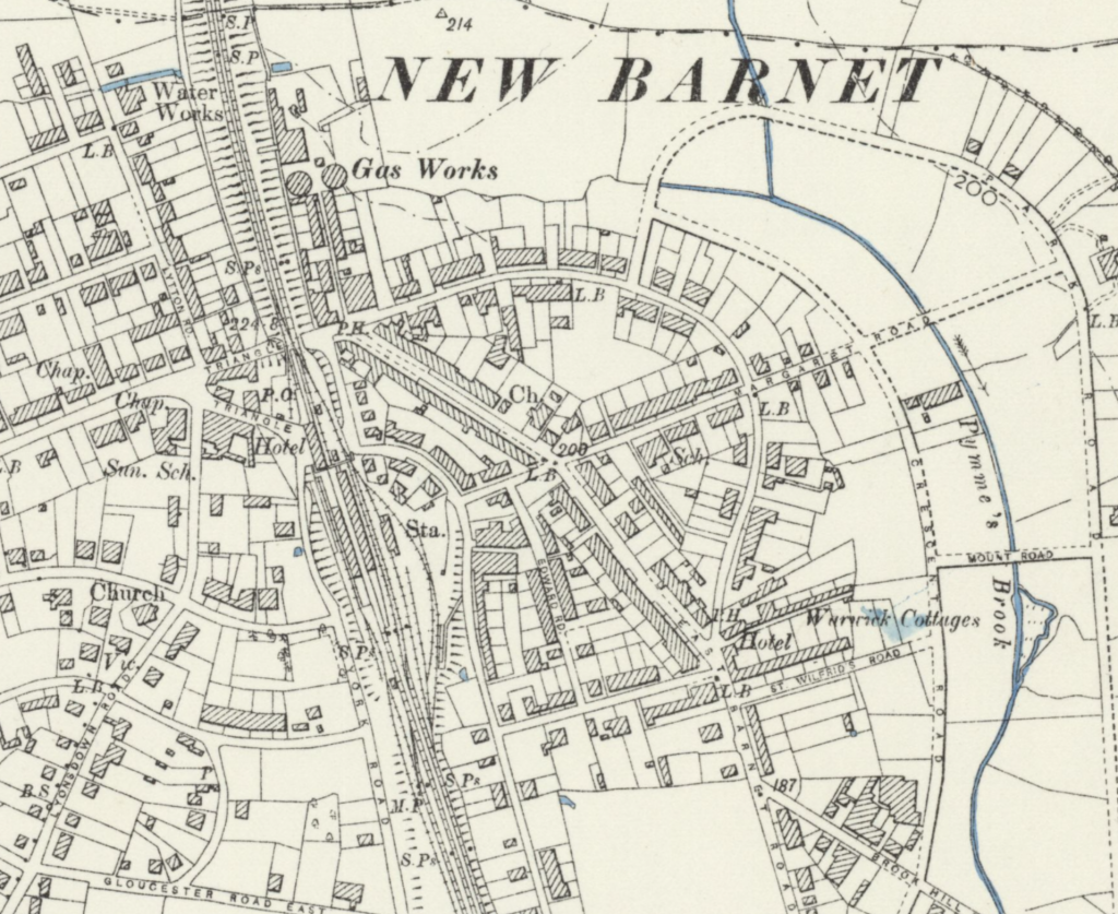
I live in suburban north London, in a neighbourhood which sprang from almost nothing in the late nineteenth century with the arrival of the railway. New Barnet station is at the end of my road and my house was built on land previously bought by the railway company: we still have the original deed of transfer from 1899 which details the sale of our plot from the railway company to the developer who bought it and built the home in which I now live.
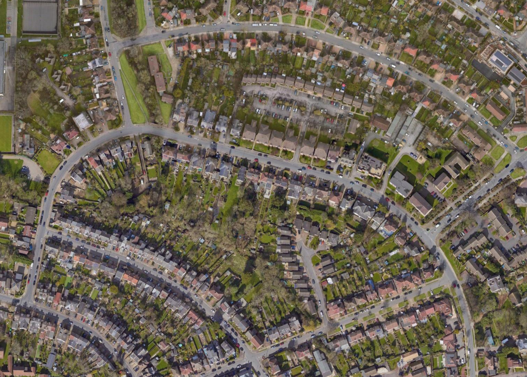
The streets here are largely lined with Victorian terraces, with some grander villas dotted around on larger plots. Sprinkled among these are houses and flats built in the later years as a result of incremental intensification, some on the former gardens of the bigger homes, others on the site of houses destroyed by bombs in the Second World War. : There’s a handful of more recent interventions: nearby, a backland site turned into eight contemporary houses which, of course, Theresa Villiers—our local MP (for the time being)—objected to, and so on.
Let’s Take a Ride…
Although we’re in Zone 5, trains run into town in less than half an hour; to Moorgate via Finsbury Park and Old Street, and recently our line has been connected to Thameslink, with peak-hour trains connecting commuters with the Elizabeth Line at Farringdon and on to southeast London. It’s a convenient place to live.
But, having said all of that, New Barnet—and other parts of suburban London just like it—simply aren’t that dense. Pockets of new development have been snuck into redundant land, former garages and car parks, derelict pubs and disused warehouses, and even so, the most recent Census data from 2021 tells us that the density of this part of north London is just 18 dwellings per hectare (dph). Maida Vale, as a comparison, has a density of more than five times that. And Maida Vale is hardly somewhere you could describe as an unpleasant place to live.
Whichever way you look at it, suburban London can clearly do more to meet the city’s housing needs.
The shortage of housing in London is at crisis levels and manifests itself in many ways. Young people have been particularly badly hit, and the consequences for our economy and society are dire. In Hackney, schools are closing because young couples are unable to afford to start families. Homelessness is at record levels, with one in ten children in parts of London classed as effectively homeless. Median house prices in the capital are now 14 times average incomes while wages have stagnated. While this cannot be entirely blamed on our inability to build enough homes, it certainly plays a very large part.
Land in London is precious, yet the suburbs have a hegemony over it. Those lucky enough to own a house in the suburbs and, in particular, those living close to public transport, surely have a moral duty to allow more housing to be built around them so that others can benefit from convenient access to all of the amenities that the city has to offer.
So where might these houses go? Do we have the space? And how can we encourage intensification to happen?
Diminishing Ambitions
The current Mayor of London’s strategic plan for the city, the “London Plan”, was finally adopted in 2021 it set ambitious targets for new homes across the city, compelling each of the planning authorities to meet specific annual housing targets both, with a proportion of these to be delivered on small sites, that is any plot with an area of less than 0.25ha (about a third of a standard football pitch).
An early consultation version of the Plan was accompanied by a series of policies which provided a framework for intensification, clearly stating that boroughs needed to accept that “local character evolves over time” and that it would “need to change in appropriate locations to accommodate additional housing provision”.
I’ve written elsewhere about the push-back from many of the outer-London boroughs to this policy which resulted in the final version eviscerating the small sites targets, and Croydon’s progressive attempts to densify suburban areas that were unceremoniously chucked out by an incoming NIMBY mayor. But even in the short period of time that Croydon’s policy was in place, it resulted in a remarkable outcome, delivering around 2,000 homes within developments of fewer than 10 homes, with house prices and rents levelling off as a result.
So, what if the lessons from Croydon could be repeated across the rest of suburban London? That’s what I’ve set out to establish.
It’s about to get a bit geeky from here on in.
Cum On Feel The (Voro)nois
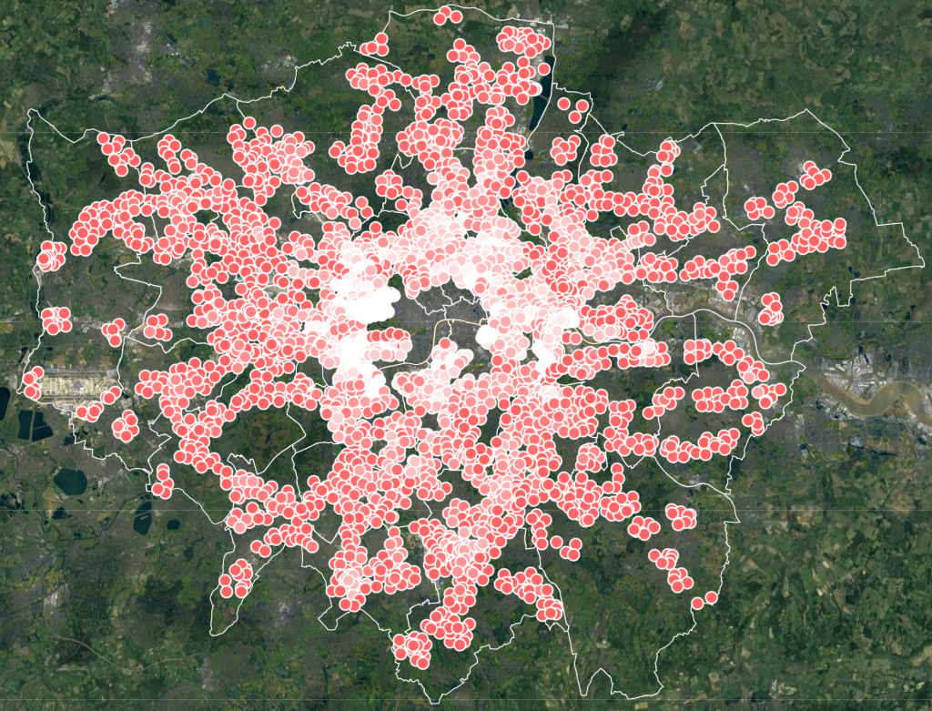
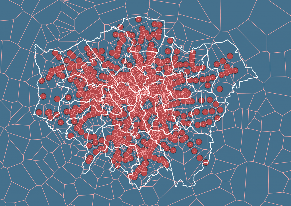
Using a combination of data from Ordnance Survey and Greater London Authority, I assembled a map of London and marked on it every station in the city – both Underground and mainline stations. Many stations are within 800m of each other, so I created Voronoi polygons to establish the closest station to every area in London.
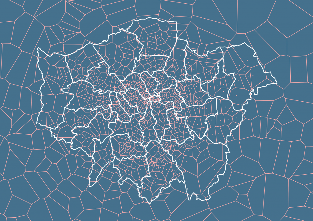
Around each station I created an 800m diameter circle, which equates roughly to a ten-minute walking distance. By combining the two geometries I established the closest station to every area in London that’s no more than ten minutes’ walk away.
Clearly this approach doesn’t take into account the various constraints on potential development, including lots of areas which would, of course, be impossible to build on. The Thames, for example, but also areas of protected land such as Strategic Industrial Land (or “SIL”) Locally-Significant Industrial Sites (“LSIS”), green belt and Metropolitan Open Land. There’s a discussion to be had about whether protecting any space close to stations is sensible, and whether golf courses and industrial land might be put to better use. But for the purposes of this exercise, I’ve excluded them; together with parks, gardens, sports pitches and any other type of open space. Given my focus on suburban areas, I’ve also excluded the “Central Activities Zone”, which covers central London. Further refinements exclude a buffer either side of national and regional roads, and existing railways.
The resulting map of London looks something like this:
So now that we have a map showing all of the potential areas that might be intensified around London’s stations, we need to introduce some data which tells us more about the neighbourhoods around them.
Census Sensibility
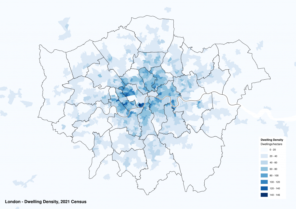
The 2021 Census provides a huge set of data broken down into geographic zones that enables us, with a bit of mapping jiggery-pokery, to intersect them with our areas of interest.
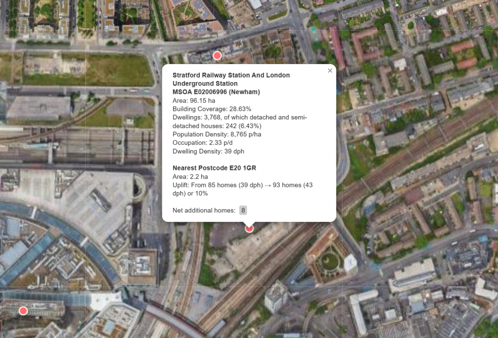
Using Census data broken down by Medium Super Output Area (MSOA) I divided the mapping areas by the equivalent polygon areas. First, though, I ran a series of mapping exercises to establish some additional figures for each of these regions: for example, using Ordnance Survey Zoomstack data to measure the approximate coverage of buildings for each MSOA polygon. Bringing the two together enabled me to examine each of these areas in more detail. Here’s an example: MSOA ref. E02000028 which is located immediately to the west of New Barnet station.

Measurements taken from GIS tell us that MSOA E02000028 has a total area of 105.61 hectares, and the census data tells us that this contains 2,783 homes (45% of which are detached or semi-detached houses) – an equivalent density of about 26 dwellings per hectare. The footprint of all the buildings is about 18.7% of the MSOA, which makes sense given the large rear gardens, even though there are no large areas of open space within it. The census also tells us that, with a total population density of 62 people per hectare, the occupancy level is only 2.35 people per dwelling…which is surprising given the number of very large houses found here (the highest dwelling occupancies in London tend to be in the East End, with parts of Bethnal Green exceeding eight people per home).
You can see the hatched areas overlaid on the image above, which represent the different Voronoi polygons described early. To the bottom right of the image you’ll find Oakleigh Park station, and this MSOA is divided into three sub-areas, each part closest to a different station: in addition to New Barnet and Oakleigh Park, the north-west corner is within 800m of High Barnet Underground Station.
26 dwellings per hectare is pretty low, although not untypical of suburban London. A modest increase over this area could result in a significant number of new homes – let’s imagine for a moment that this is increased by just 25% (hardly a transformative figure). Yet, even at these modest numbers this results in 686 additional homes – an uplift in density from 26 to 32 dwellings per hectare.
Even 32 dwellings per hectare is pretty modest when compared to other parts of London. MSOA E02000589 covers the area around High Street Kensington, topping out at 137 dwellings per hectare (dph). This is probably a bit much for Zone 5, but Herne Hill (MSOA E02000642) achieves a density of 40 dph and can hardly be considered overcrowded.
With all of this in mind, I’ve established a few rules to apply to my data to try and estimate what a modest uplift in density might achieve. Arguably, nowhere in London that’s within 800m of a station should have a density of less than 40dph, so I’ve set that as a minimum. And, although some parts of the capital exceed this, I suggest that the increase in density should not push an area beyond 100dph. Within these thresholds, I’ve set a few additional rules: where detached and semi-detached houses form more than 40% of the total dwellings, I’ve set the potential density increase at 50%; where they’re less than 10% of the total housing stock, it’s 10%. For everything else I’ve assumed a 25% increase.
I’ve made a further adjustment where buildings cover less than 25% of the available land, adding a compound increase of 40% to this figure. The resultant algorithm is something like this (where “familyHouses” means a semi-detached or detached dwelling):
# First, calculate the initial uplift in density based on the proportion of "family homes"

IF familyHouses > 40% THEN newDensity = existingDensity x 1.5
ELSE IF familyHouses < 10% THEN newDensity = existingDensity x 1.1
ELSE newDensity = existingDensity x 1.25

# Then add a compound density based on the total percentage coverage (footprint) of buildings over the MSOA area

IF coverage < 20% THEN newDensity = newDensity x 1.4

# Finally, if the new density exceeds 100 dph, cap the increase to this level (this means that any areas that already exceed 100dph see no increase)

IF existingDensity > 100 THEN newDensity = existingDensity
ELSE IF newDensity > 100 THEN newDensity = 100
ELSE IF newDensity < 40 THEN newDensity = 40
Applied across the entire city, this results in a net increase of some 900,000 homes, with each of the boroughs seeing the following uplift:
| Borough | Net New Homes |
|---|---|
| Barking & Dagenham | 15,070 |
| Barnet | 54,129 |
| Bexley | 37,985 |
| Brent | 32,719 |
| Bromley | 68,426 |
| Camden | 8,625 |
| Croydon | 67,165 |
| Ealing | 34,616 |
| Enfield | 57,520 |
| Greenwich | 28,739 |
| Hackney | 10,886 |
| Hammersmith & Fulham | 9,755 |
| Haringey | 18,646 |
| Harrow | 39,122 |
| Havering | 33,385 |
| Hillingdon | 47,922 |
| Hounslow | 27,313 |
| Islington | 7,336 |
| Kensington & Chelsea | 5,537 |
| Kingston upon Thames | 27,862 |
| Lambeth | 16,601 |
| Lewisham | 31,801 |
| Merton | 23,681 |
| Newham | 26,094 |
| Redbridge | 31,856 |
| Richmond upon Thames | 31,589 |
| Southwark | 17,817 |
| Sutton | 32,490 |
| Tower Hamlets | 11,633 |
| Waltham Forest | 21,822 |
| Wandsworth | 15,593 |
| Westminster | 5,040 |
| Total | 898,776 |
Unsurprisingly, those boroughs with the largest area see the greatest net increase in new homes, with Bromley at the top with 68,426 new dwellings, and Croydon slightly behind with 67,165. The inner London boroughs such as Camden, Kensington & Chelsea and Westminster see the least. The City of London is at zero and doesn’t appear in this table because it’s entirely within the Central Activities Zone and excluded as a result.
It’s important to remember that the figures I’ve listed above are limited to those areas within 800m of a station. That means there’s a lot of outer London excluded from my estimates, but imagine that we increase the density here as well, perhaps by a more modest amount…there would surely be many more thousands of homes that could be built in addition to the 900,000 I’ve suggested above.
Due to limitations in the mapping data, there are some anomalies which skew the figures in a few areas. For example, the Ordnance Survey mapping data doesn’t identify football stadia within its “sites” geometry, and while I’m ambivalent about the so-called beautiful game, and would be quite happy for every football stadium in London transformed into housing, I’m not sure Arsenal fans are quite ready for the Emirates Stadium to go the same way as their former ground just yet.

There’s also no adjustment made for those areas subject to wider regeneration schemes or empty sites. The large car park to the east of Stratford Westfield, which was going to be the home of London’s version of the Madison Square Gardens’ Sphere has an area of around 2.5 hectares and could feasibly provide 200-300 homes, but my methodology only shows an uplift of eight, as the density calculation is based on the entire MSOA area rather than this small section of it.
There are some other issues which could do with refinement. The MSOA boundaries do not take into account the type of space within them so, for example, with two polygons of equal size might have varying levels of undevelopable space. The total number of existing dwellings might be the same in both cases, and therefore the overall density would be shown as equal, however in reality the same number of homes could be crammed into a smaller area. This would mean that the impact of intensification would be more profound in the latter.
In reality, though, I’m not sure these anomalies make much of a difference overall as they seem to balance out across the wider picture.
So, these oddities aside, what does suburban intensification look like when applied to largely residential neighbourhoods?
Learning from south London
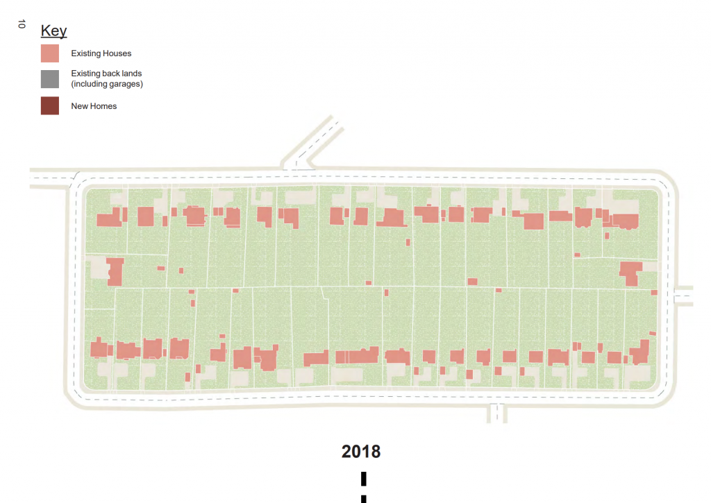
The troubled history of Croydon’s Suburban Intensification SPD is beyond the scope of this article (I wrote about its demise for OnLondon), but it really was the gold standard for how outer London boroughs might encourage development on small sites in residential areas.
The guide provided a series of simple diagrams which mapped out the evolution of suburban blocks to show how, over an 18-year period, infilling gap sites and the replacement of some large houses with a combination of flats and houses. Let’s take a look at these to see what this means in numerical terms.
The first extract, below, shows a typical suburban block of detached houses. In the top example (2016) there are 37 detached houses. Although the plan is supposed to be a generic example, it’s almost certainly based on a real part of Croydon. There are large rear gardens and gaps of varying widths between the houses themselves.
In the “evolved” condition of 2036, several of the houses have been replaced with new buildings, and some have had new homes erected in rear gardens. From this plan it’s impossible to count the new number of dwellings that might be delivered in this way (it’s not really the point of the drawing), but the drawing does attempt to show the subdivision of the new buildings into the individual demises. Assuming nothing is taller than three storeys, I count at least 50 new homes, including a mix of houses and flats—and 29 of the original houses remain. In total, that’s a doubling of density – and it can hardly be said that the character has changed beyond all recognition: the large rear gardens largely remain and the coverage of buildings relative to undeveloped space is minimal.
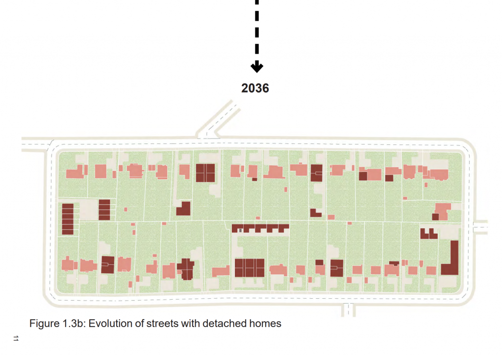
This demonstrates that the kind of intensification we’re talking about is entirely achievable, and any objection on the basis of unacceptable change in character is for the birds.
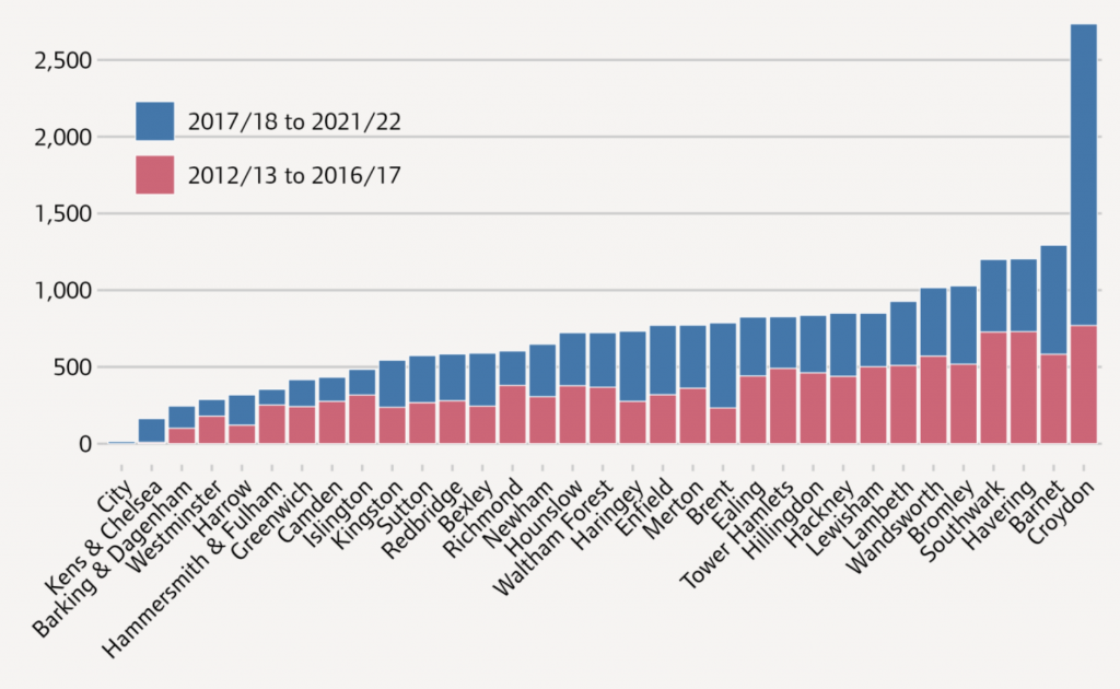
Such an approach is entirely possible if we’re prepared to implement to bold policy reforms needed to enable this kind of development to come forward. In the brief period between the Croydon SPD being adopted in 2018, and it’s unceremonious scrapping in 2022, there was a remarkable uptick in small site development across the borough. The GLA’s annual Housing in London report shows that during this time Croydon delivered (delivered, not just approved) nearly 2,000 homes within developments consisting of fewer than 10 homes: more than three times the next highest, Barnet.
It’s time to adopt a London-wide policy which encourages similar levels of development across all of London’s suburbs. We know we need the homes. We now know we have the capacity. Let’s get on and do it!
You can have a play with my online map showing all areas of suburban intensification by clicking the image below.